BuCard
A smart networking platform that replaces paper business cards with QR, NFC and searchable profiles across web, iOS and Android.
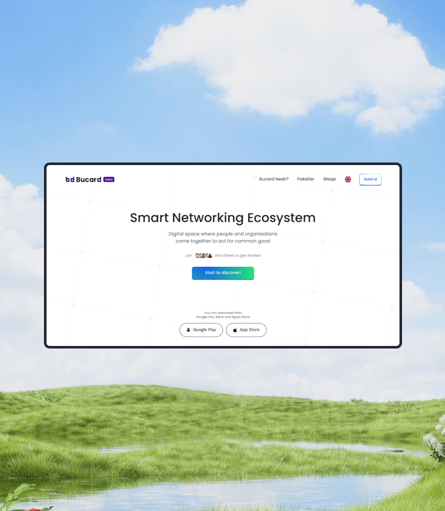
Paper cards get lost. Contacts go stale.
BuCard is a Baku startup building a digital business card and contact management platform. A person or a company gets a profile with a unique link, a QR code and NFC sharing, and saves the people they meet into groups called boxes.
The founding team's pitch rested on a simple observation: traditional contact management is inefficient, so contact details get lost or go out of date. Their deck cited Salesforce research that 91 percent of businesses hold inaccurate contact data. BuCard set out to be the single place where that data stays current, and the place where you find the right professional nearby by skill rather than by chance.
I joined as the product design lead while the startup was moving from idea stage, backed by an initial USD 10,000 investment, to a first public build.
Design direction, not just screens.
I owned the product design direction and worked with two junior designers. In practice that meant:
- Defining the UX strategy with the CEO and product owner, including the free versus paid profile model and the box concept at the heart of the product.
- Designing the core flows and the first high-fidelity screens for the web dashboard, the mobile app and the public profile page.
- Reviewing the junior designers' work against those flows so every surface stayed consistent.
- Running design quality assurance on the iOS, Android and web builds before release, with annotated review boards handed to the developers.
The wider team was a CEO and product owner, a CTO, a mobile developer, a front-end developer, back-end developers, a brand designer and a project manager.
One identity, two sides, three tiers.
Before any screen, we wrote the product down. The spec defined two sides: free users and paid profiles. Free users register with a name and a phone number verified by one-time code, get a unique ID, an auto-generated username, a QR code and NFC sharing, can search, and can save profiles into boxes. Paid profiles come in two packages, Personal and Business, and unlock the things that make a profile discoverable: keywords, locations, portfolio items, services, social links and a listing in the company catalogue.
Two rules in the spec mattered most for the design. A free user who upgrades with the same phone number keeps all their boxes. And a company that passes verification gets a badge, a place in the catalogue, and access to the CVs that personal users choose to make visible to employers.
Free
0 AZN
- Search and boxes
- Personal QR code and unique link
- Share by QR and NFC
- Contact base management
Personal
5.90 AZN / month
- Everything in Free
- Up to 10 search keywords and 1 location
- Portfolio, services, social links
- CV visible to verified employers
Business
29.90 AZN / month
- Everything in Personal
- Up to 20 keywords and 10 locations
- Products and services catalogue
- Verified badge and HR access
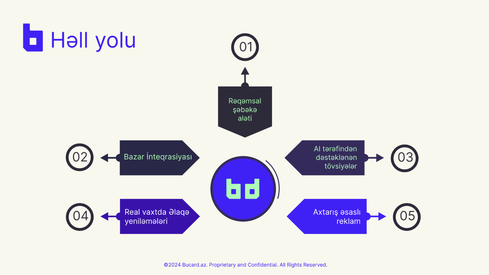
Boxes instead of a contact list.
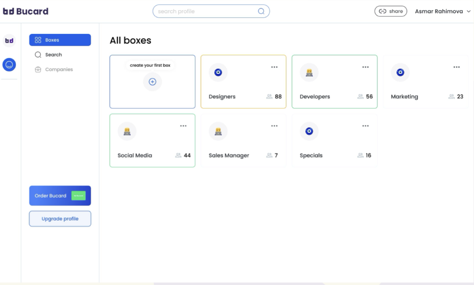
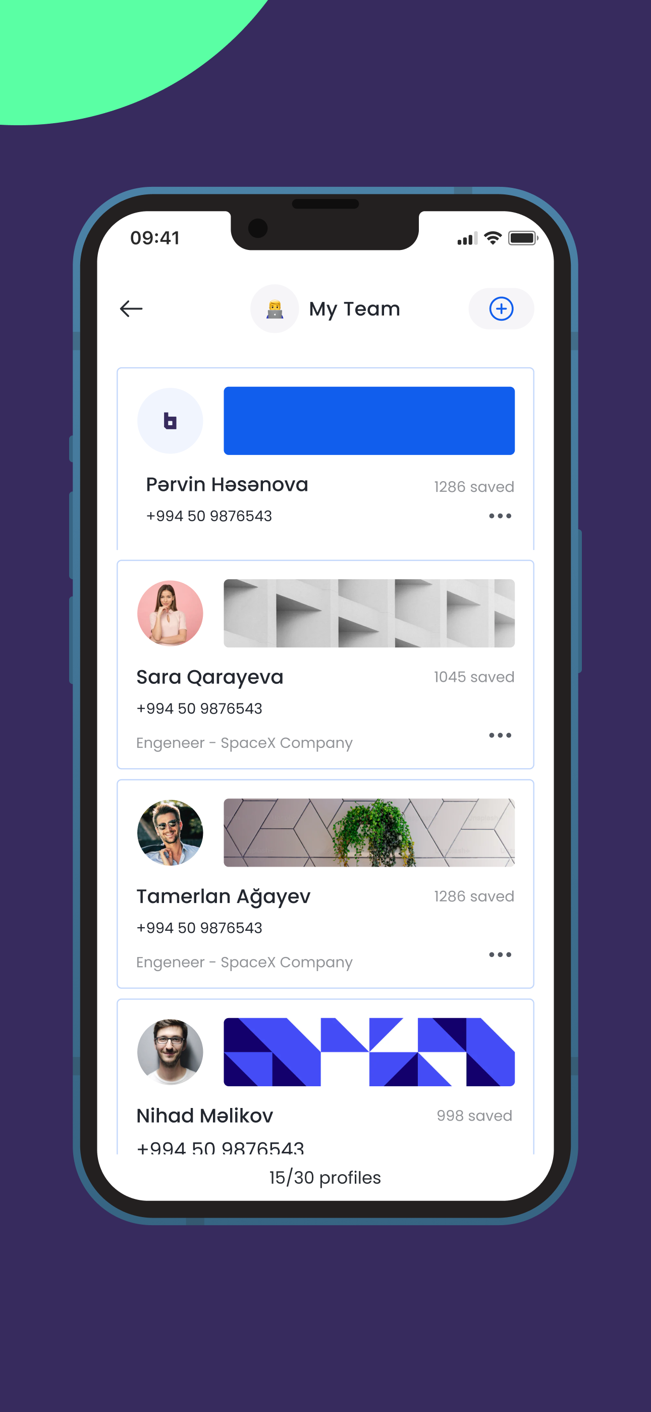
The central design decision was to organise saved contacts into boxes rather than one long list. A box has a name, an icon and a count. Designers, Developers, Marketing, Sales Manager: the user decides the structure, and the dashboard opens on it. This is what makes BuCard feel like a tool for working your network rather than a phone book.
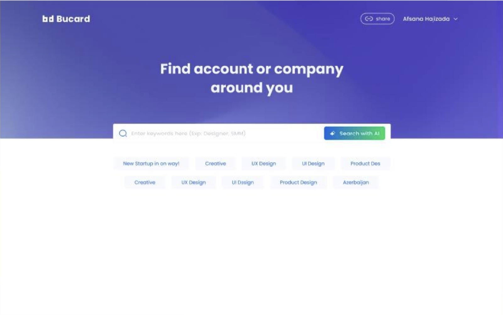
The sidebar keeps the three jobs separate: Boxes for what you have saved, Search for finding new people, Companies for verified organisations. The two commercial actions, ordering a physical card and upgrading the profile, sit below the navigation so they are always reachable but never in the way.
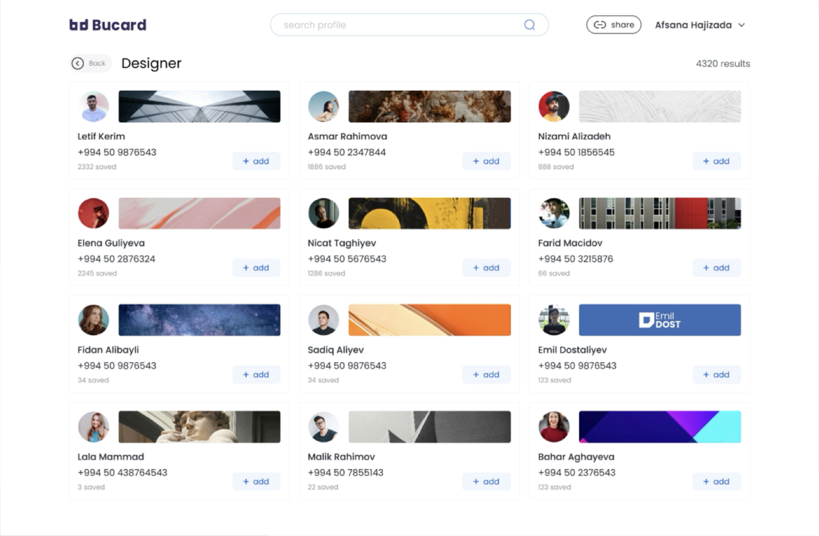

Share in two taps, save in one.
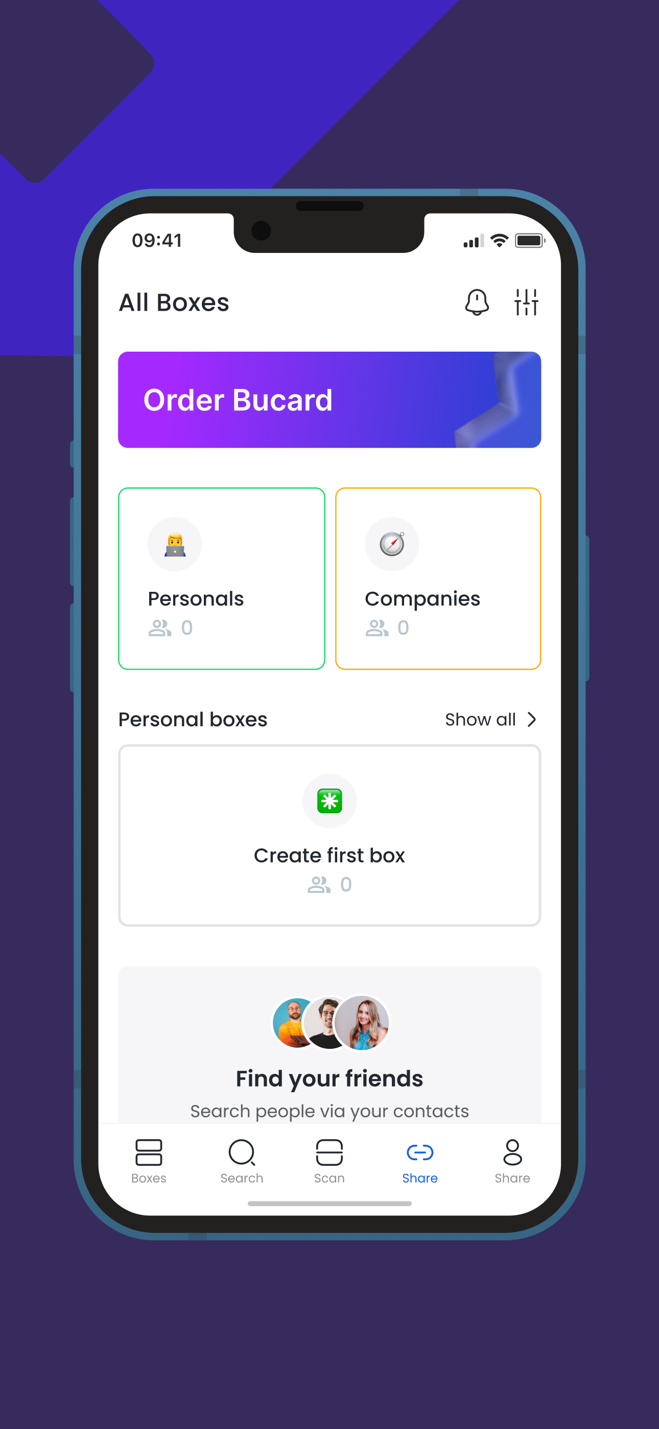
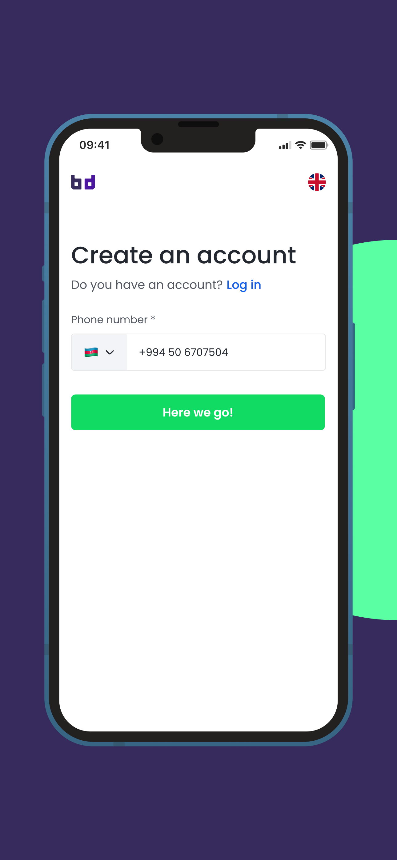
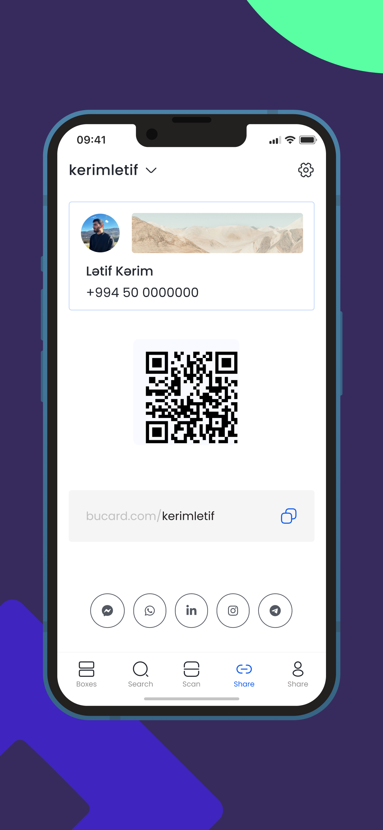
On mobile the job is different. People use the app in the room, right after meeting someone, so the two things that matter most are showing your QR code and scanning theirs. Both live in the tab bar. Sign-up is a phone number and a one-time code, nothing else, and the username and QR code are generated for you.
The box model carries over without change. The home screen shows the Personals and Companies split, the user's own boxes, and a prompt to find friends from the phone's contacts, which was the main growth lever for a product that is only useful once the people you know are on it.
The one paper card you keep.
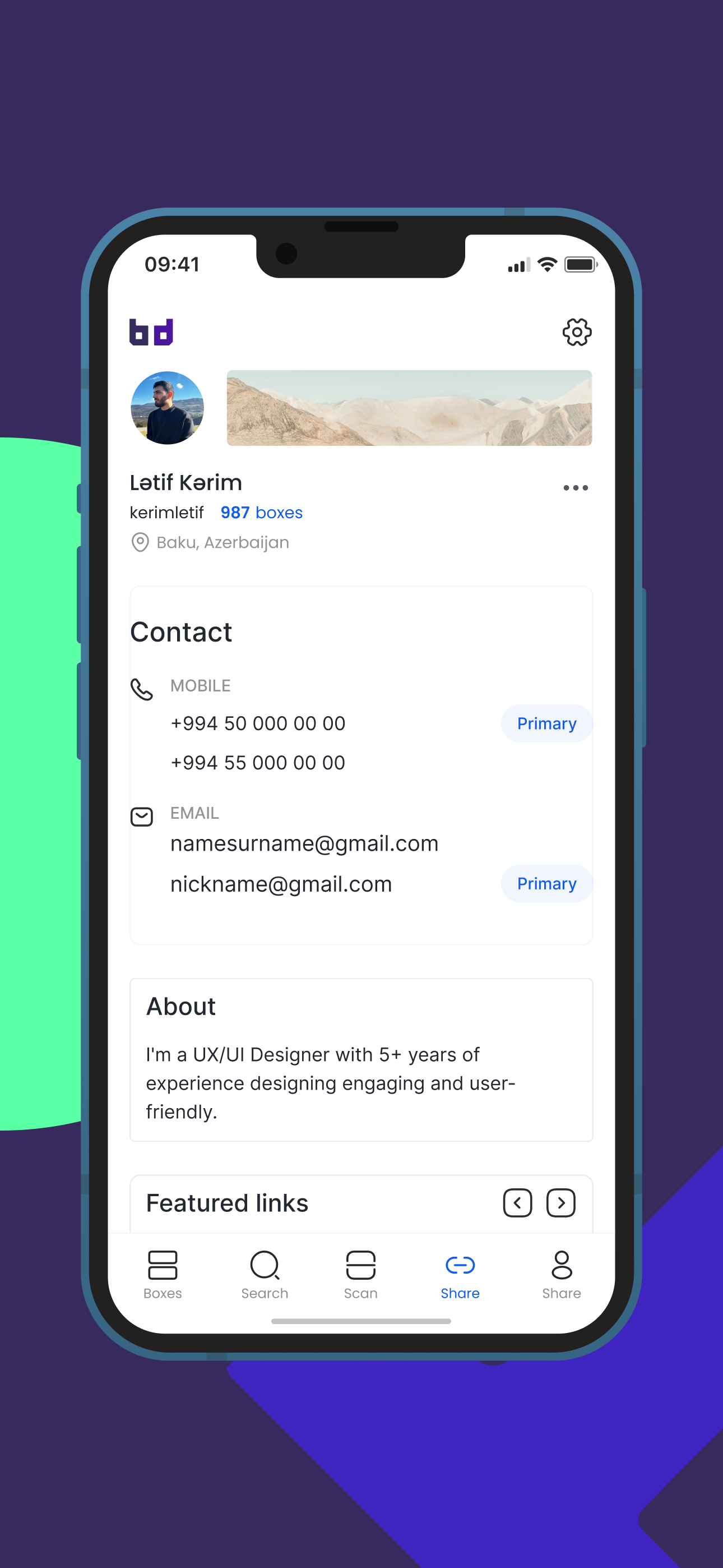
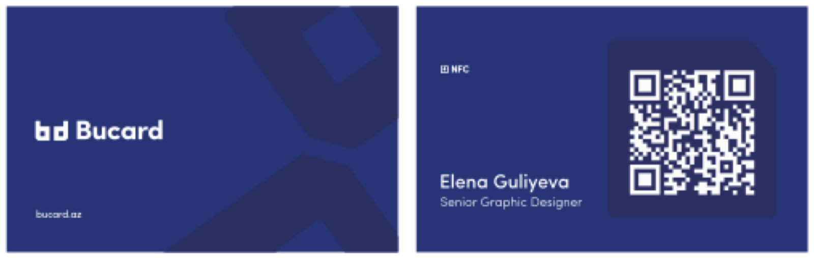
BuCard also sells a printed NFC card. Tapping it or scanning the QR opens the owner's live profile, so the card never goes out of date even when the job title does. The order flow is the same "Order Bucard" entry point on web and mobile, and the card layout was built from the same brand system as the app.
Reviewing the build, not just the file.
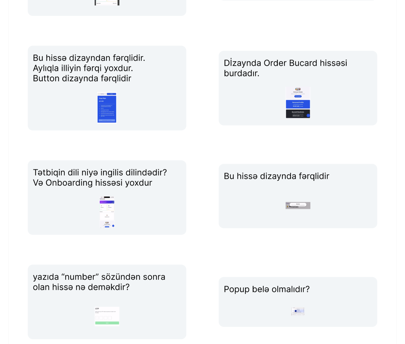
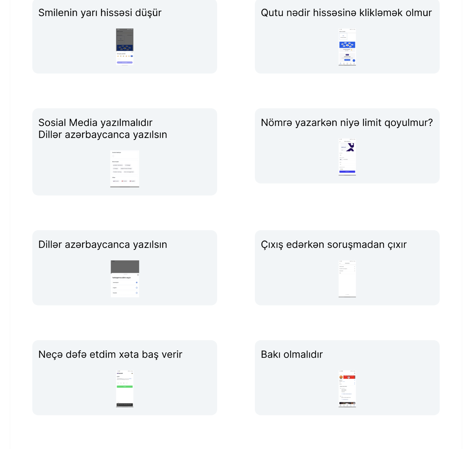
With a small team and three platforms, the biggest risk was drift between the design and what shipped. So before each release I went through the iOS, Android and web builds screen by screen and produced annotated review boards for the developers, one card per issue, each with a screenshot.
The boards caught the things that quietly erode trust in a new product:
- Mixed languages. Parts of the app shipped in English while the audience and the content were Azerbaijani, so every label was listed for translation.
- Missing onboarding, and filter and notification controls that existed in the design but not in the build.
- Pricing screens where the monthly and yearly toggle made no difference to the price shown.
- Input rules: no length limit on phone numbers, a promo code field that looked mandatory, log-out without confirmation.
- Navigation bugs on iOS where scrolling or opening several pages froze the screen.
Each item was closed before the store release. The same board format was reused for every later update, which is what let the product keep its quality as the user base grew.
Four calls that shaped the product.
Boxes, not a flat list
A list of hundreds of contacts is what the phone already has. Grouping into named boxes gave BuCard a reason to exist and gave the dashboard a structure that scales from one contact to a thousand.
Phone number as the only identity
No email, no password. A number verified by one-time code is what people in this market already use to log in everywhere else, and it is what a business card carries. Usernames and QR codes are generated, so there is nothing to invent at sign-up.
Keep the free tier genuinely useful
Free users can search, save into boxes and share by QR and NFC. What the paid tiers sell is discoverability: keywords, locations, portfolio, catalogue listing. People upgrade because they want to be found, not because the free product was crippled.
Treat design QA as a release gate
The annotated review boards became a fixed step between the build and the store. It cost a day per release and saved weeks of post-launch fixes.
From idea stage to a growing user base.
Development started in June 2024 and the first public build launched in March 2025. By June 2025 the product had 462 users. In the six months after the updates that followed my design direction, BuCard added more than 1,500 new users.
Along the way the startup was certified as a legal startup in Azerbaijan, joined the A-Hub accelerator programme, and secured an AZN 16,000 grant from the Small and Medium Business Agency. The screens in this case study are the ones that went into the 2025 investor deck.
What I would do differently. Set the product language and a single copy source before development starts. Most of the QA findings were language and copy drift between an Azerbaijani spec and an English build, and a shared copy document from day one would have removed them.