Invoice Reporter
A web app for small businesses to create and send invoices, record payments and report on income and expenses in three currencies.
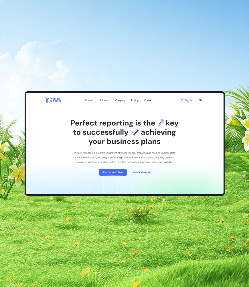
Invoicing is easy. Knowing where the money is, is not.
Invoice Reporter is a cloud product by Digera LLC in Baku. It lets a company prepare and send invoices, acts and e-invoices, receive the invoices partners send to them, record payments against each one, and report on invoices, payments, managers and jobs from anywhere.
The audience is small and medium businesses in Azerbaijan that work with partners abroad. They invoice in manats, euros and dollars at the same time, they give several employees access to the books, and they want reports without learning an accounting package. The product promise is the one in the headline: perfect reporting is the key to achieving your business plans.
I joined as the only designer and owned the product design from the first flows to the UI the developers built from.
One designer, the whole stack.
With no design team around me, every layer was mine:
- User flows for sign-up, trial and plan upgrade, creating invoices and costs, adding managers, jobs, debtors and creditors.
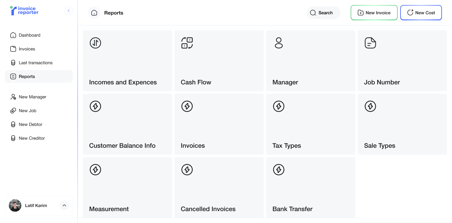
- Wireframes and then high-fidelity UI for the web app: sign-in, dashboard, invoices, transactions and the reports hub.
- The marketing site, from a first generic draft to the localized version that is live today.
- Dev-ready handoff in Figma, and later a code version of the landing page so design and front-end stayed in sync.
Who owes you, who you owe, in every currency.
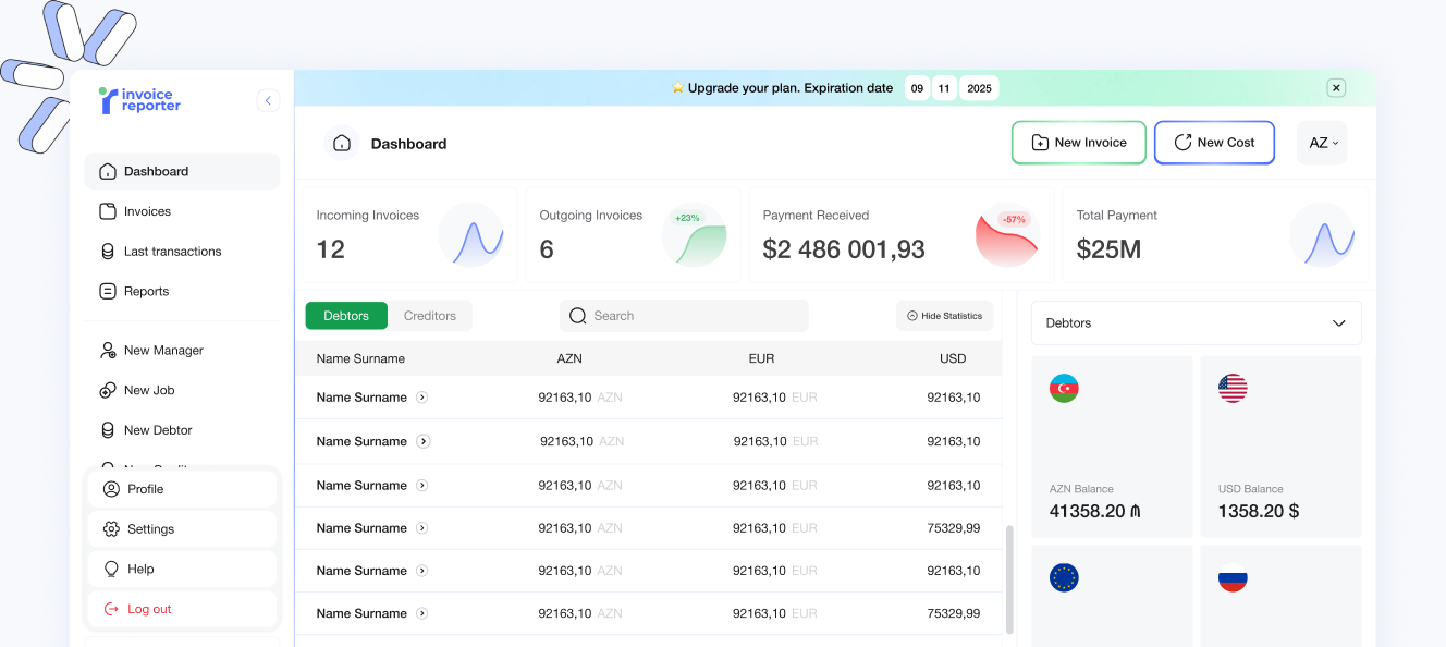
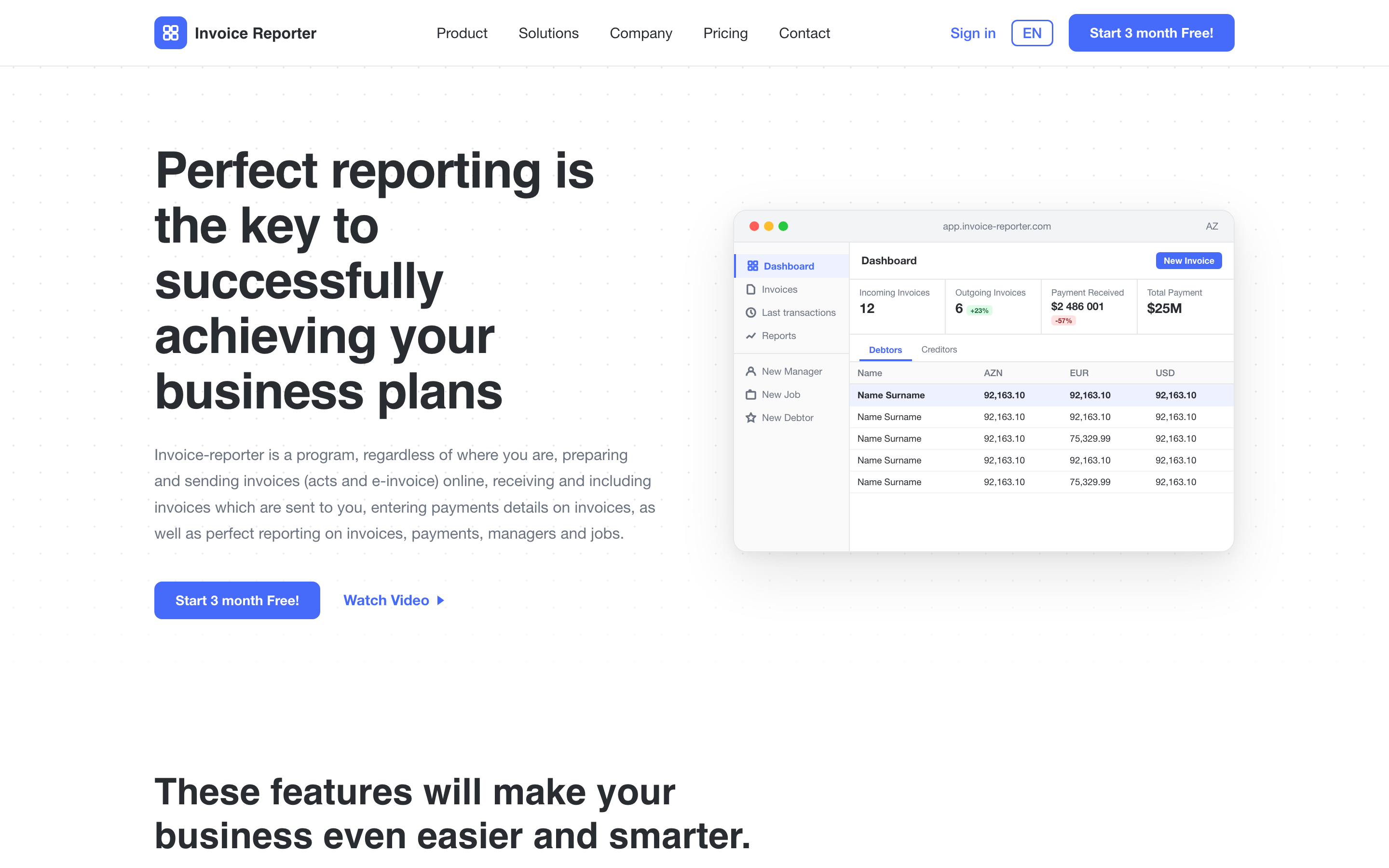
The dashboard answers the question an owner asks every morning. Four cards at the top show incoming and outgoing invoices, payment received and total payment, each with a small trend line and a change badge. Below them sits the table that matters most: debtors and creditors, one row per partner, with the balance in AZN, EUR and USD side by side instead of a currency switcher that hides two thirds of the picture.
The two things a user does most, raising an invoice and recording a cost, are permanent buttons in the header. Invoice is green, cost is blue, and that colour pair runs through the whole product so income and expense never look alike. A thin banner above the dashboard shows the plan's expiry date, so the trial-to-paid moment is always visible without a pop-up.

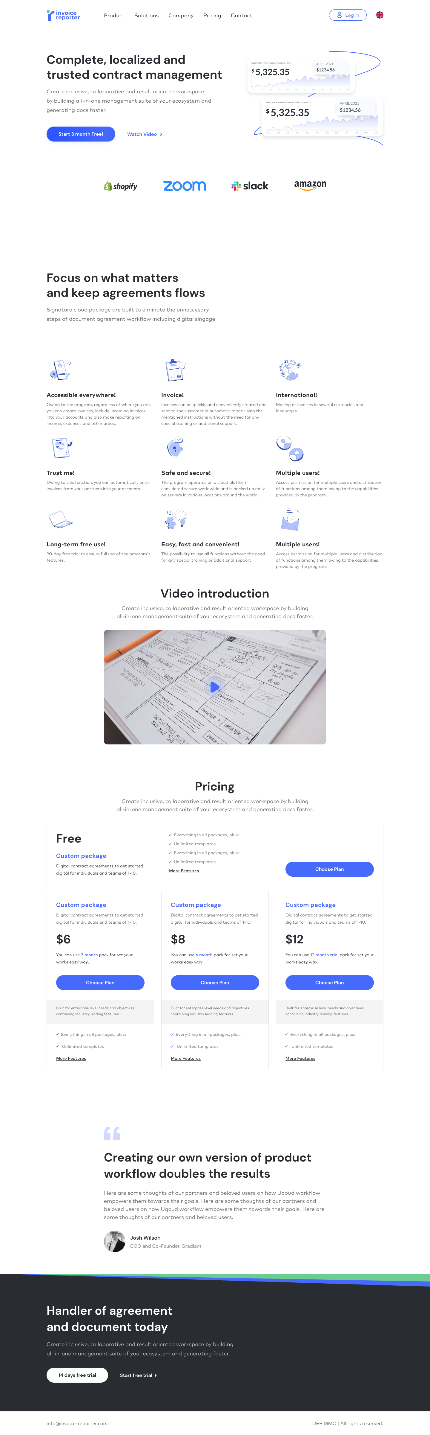
From generic SaaS page to the real product.
The first landing draft looked like every SaaS page: a contract-management headline, a logo strip of companies that were not customers, placeholder testimonial copy and dollar pricing. It would have sold a product that did not exist.
The second version threw that away and built the page from what the app actually does. The headline became the product promise. The nine features are the real ones, each with its own illustration. The hero shows the real dashboard. Pricing moved to manats with the three real plans and the sub-user add-ons, and the page got an Azerbaijani and English switch. This is the version that shipped at invoice-reporter.com.
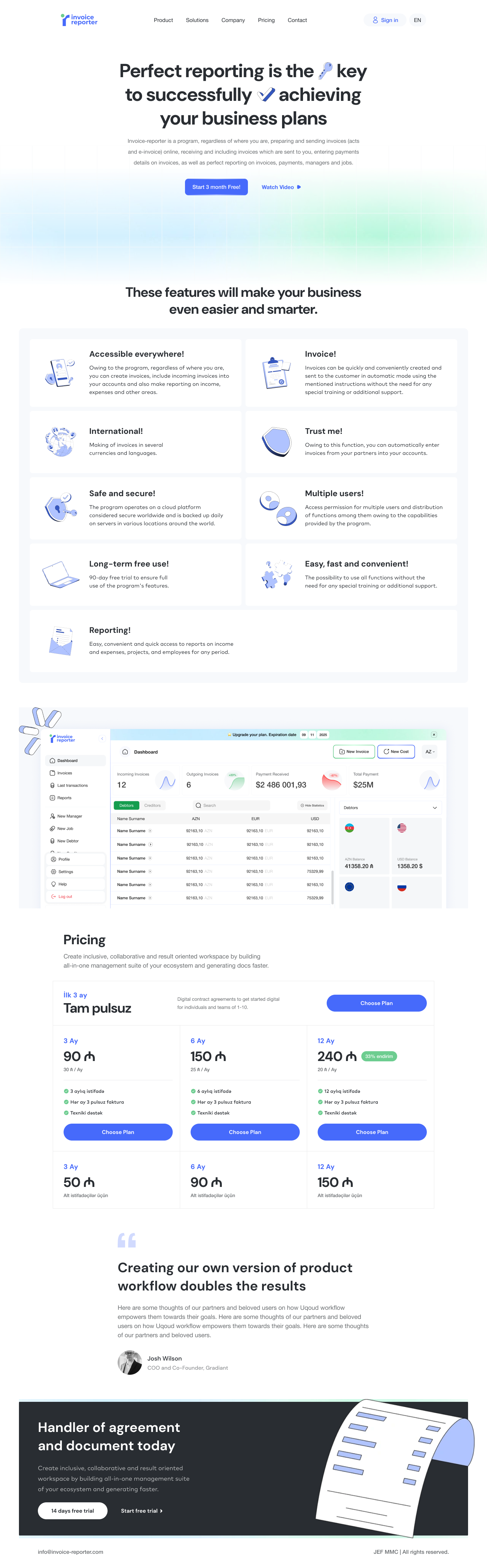
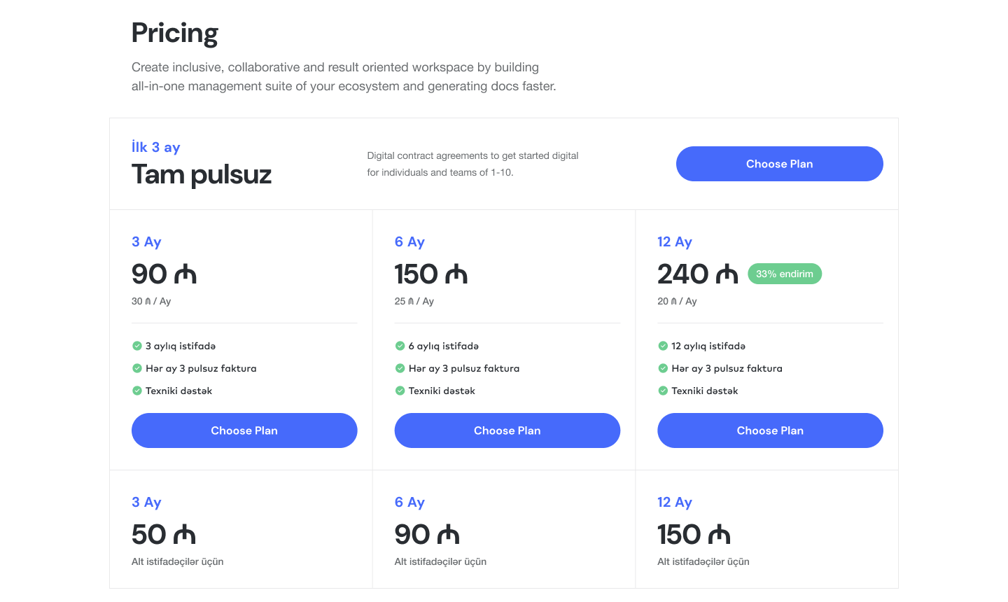
The landing page as code, and a plugin to bring it home.
In 2026 I rebuilt the landing page directly in HTML and CSS, using the same tokens as the Figma file: one blue, one dark, one muted grey, 8px radii. It let me try a bento feature grid, a dedicated dashboard section and a stats row at real size, with real text wrapping, before anyone touched the production front-end.
To keep the Figma file honest I wrote a small Figma plugin, with AI assistance, that regenerates every landing section as editable Figma components on a new page: navbar, hero, logo strip, stats, features, testimonials, pricing, FAQ, call to action and footer. Change the code, run the plugin, and the design file catches up. It is the opposite of the usual handoff, and for a one-designer team it removed a whole category of "the design is out of date" conversations.
Four calls that shaped the product.
Three currencies in one row
A currency switcher is the default pattern, and it hides most of a multi-currency business. Showing AZN, EUR and USD as columns of the same table costs horizontal space and saves the user from switching three times to understand one partner.
Colour means money direction
Green is income, blue is expense, everywhere: the New Invoice and New Cost buttons, the sign-in button, the trend badges. Users stop reading labels after a day.
Reports as a hub, not a filter wall
Accounting tools usually present one report screen with a dozen filters. Here each report is a named tile with an icon. A manager looking for cash flow finds it in one click and never meets a filter they do not need.
Throw away the first landing page
The template draft was finished and looked fine. Replacing it with real features, real screens and manat pricing was more work and a better product page. Honest beats polished.
Paying users from month one.
Invoice Reporter launched with the localized site and the app you see above and reached more than 100 paying users in its first month. It is live at invoice-reporter.com with a 90-day free trial and plans from 20 manats a month, and I continue to design the product as it grows.
What I would do differently. Start from the product, not from a template. The first landing draft cost a few days and taught the lesson that shaped the rest of the project: every screen on a marketing page should be a screen the user will actually get.